Analyze French Consumption
Analyze french electricity consumption. More analysis about french energy:
import pandas as pd
import numpy as np
import seaborn as sns
import matplotlib.pyplot as plt
%matplotlib inline
sns.set(style="darkgrid")
Fetch data
consumption = pd.read_csv('consommation-quotidienne-brute-regionale.csv',
                          sep=';',
                          parse_dates=[0])
consumption.drop(['Date', 'Heure', 'Code INSEE région', 'Statut - GRTgaz',\
                  'Consommation brute gaz (MW PCS 0°C) - GRTgaz', 'Statut - Teréga', \
                 'Consommation brute gaz (MW PCS 0°C) - Teréga', 'Statut - RTE'],
                 axis=1, inplace=True)
consumption.columns = ['date', 'region', 'consumption']
consumption.set_index('date', inplace=True)
consumption_pivot = consumption.pivot_table(values='consumption',
                                            index='date',
                                            columns=['region'],
                                            aggfunc='mean')
consumption_pivot.dropna(inplace=True)
Analyze
Global consumption
consumption_global = pd.DataFrame(consumption_pivot.sum(axis=1), columns=['consumption'])
consumption_global['year'] = consumption_global.index.year.data
consumption_global['month'] = consumption_global.index.month.data
consumption_global = consumption_global.pivot_table(values='consumption',
                                                    index='year',
                                                    columns='month',
                                                    aggfunc='mean')
/home/jolainfra/.local/lib/python3.6/site-packages/ipykernel_launcher.py:2: FutureWarning: Int64Index.data is deprecated and will be removed in a future version

/home/jolainfra/.local/lib/python3.6/site-packages/ipykernel_launcher.py:3: FutureWarning: Int64Index.data is deprecated and will be removed in a future version
  This is separate from the ipykernel package so we can avoid doing imports until
fif, ax = plt.subplots(ncols=1, nrows=1, figsize=(12, 4))
sns.heatmap(consumption_global, ax=ax)
plt.show()
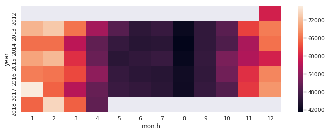
National consumption follows weather. Graphic shows us that low temperatures during winter lead high consumptions. Indeed electrical heater are still used in France they belong to the all electric policy used to reduce gaz and petrol dependance.
August is also a french speciality. Most of people are in holiday during this month, the whole french economy run slower. This behaviour explains the high darkness we see on graphic.
Consumption by region
consumption_by_day = consumption_pivot.groupby(by=pd.Grouper(freq='D')).mean()
consumption_by_day.reset_index(inplace=True)
consumption_by_day = consumption_by_day.melt(id_vars='date', value_name='consumption')
consumption_by_day['weekday'] = consumption_by_day['date'] \
                                .map(lambda x: 'weekday' if x.weekday() < 5 else 'weekend')
fig, ax = plt.subplots(ncols=1, nrows=1, figsize=(12, 8))
sns.violinplot(data=consumption_by_day, x='consumption', y='region',
               hue='weekday', split=True, ax=ax)
ax.set_title('Power consumption by region')
ax.legend(title='')
plt.show()
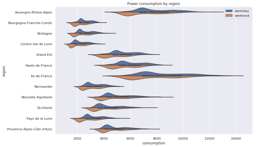
Two regions stand out : Auvergne-Rhône Alpes and Ile de France. Since Louis XIV, France is centralised on Paris and this region, Ile-de-France. This region is the smallest region in France, but the first for consumption. This centralisation explains consumption score but not the consumption sprawl in Ile-de-France.
Auvergne-Rhône Alpes has many economic area. And Lyon, the second french city, belongs this region.
As expected, consumption is lower during weekend than during weekday.
# Remove week day
consumption_pivot_weekday = consumption_pivot[consumption_pivot.index.weekday < 5]
# Compute amplitude ratio and mean for each day
group = consumption_pivot_weekday.groupby(by=pd.Grouper(freq='D'))
mag = group.max() / group.min()
mag = mag.fillna(mag.mean())
mean = group.mean()
mean = mean.fillna(mean.mean())
fig, axis = plt.subplots(nrows=4, ncols=3, figsize=(14, 14), sharex=True, sharey=True)
axis = axis.reshape(12)
colors=['Blues_r', 'Greens_r', 'Greys_r', 'Purples_r', 'Oranges_r']
for i in range(mag.columns.size):
    column = mag.columns[i]
    ax = axis[i]
    sns.kdeplot(mean[column], mag[column], cmap=colors[i%len(colors)], alpha=0.8, ax=ax)

    ax.set_title(column)
    ax.set_xlabel('')
    ax.set_ylabel('')
    ax.set_xlim([500, 12000])
    ax.set_ylim([1.1, 1.8])

axis[1].set_title(r'Ratio $max_{day} / min_{day}$'+'\n'+mag.columns[1])
axis[-2].set_xlabel('Average consumption (MW)')
plt.show()
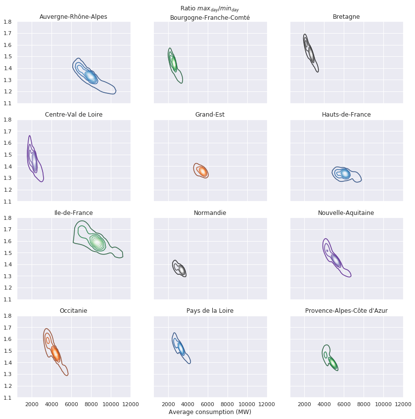
This graphics is a bit more complex : on x axis there is consumption and on y axis there $\frac{max_{day}}{min_{day}}$, a kind of daily ampltiude. The differences between regions become gorgeous in the picture :
- Ile-de-France sprawl can be explained by its high amplitude. Différence between max and min consumption over a day can reach 80%.
- For the same consumption Auvergne Rhône Alpes seems to have less amplitude than Ile-de-France.
- Regions like Bourgones Franche-Comté, Bretagne, Centre-Val de Loire and Occitanie share the same behaviour. They don’t consume a lot of energy and theirs consumptions seem to be stable over time. But theirs amplitudes over a day seem to be very instable, they oscillate from 30% to 70%.